.png?width=600&height=408&name=march%202023%20-%20french%20toast%20(1).png)

.png?width=1080&height=1080&name=Bold%20Metrics%E2%80%99%20digital%20twin%20technology%20helps%20some%20of%20the%20worlds%20biggest%20bands%20increase%20conversion%20and%20AOV%2c%20reduce%20returns%2c%20optimize%20their%20customer%20experience%2c%20and%20boost%20brand%20loyalty.%20(2).png)

.png)
When it comes to sizing, traditional size charts are a helpful tool but they’re far from perfect. Even the most polished chart can only take your customers so far, leaving them to guess how a garment will actually fit. That guesswork leads to cart abandonment, higher return rates, and frustrated shoppers.
This blog will cover 10 tips to make your size charts more usable because a better experience here can go a long way toward building trust and reducing friction in the buying journey. But if you’re ready to take a more strategic, future proof approach to sizing, there’s a smarter way. Bold Metrics’ AI driven sizing platform goes beyond static size charts to deliver personalized fit recommendations for every shopper, boosting conversion, reducing returns, and turning sizing into a revenue driver.
Match your chart to the product type and brand
There’s nothing worse (and less trustworthy) than one generic size chart that applies to any and all product types and brands you sell. Shoppers know that even within a single brand, individual styles can have different sizing specifications and that many brands use vanity sizing that may not line up with other brands’ sizes.
For the best user experience, only show size charts that match the product type being viewed, and ideally match the brand (if you sell multiple brands in your catalog).
Highlight row and column headings
It’s hard work to cross-reference measurements to their body location and corresponding size when visually scanning a table. The bigger the table, the harder this is. Applying styling treatments to headings, such as bold type, borders, or shaded fields, helps users navigate tables more easily.

Freeze header rows and columns for scrollable tables
Scrollable tables are often unavoidable, especially on mobile. But if headers scroll out of view, users lose their frame of reference. Always freeze the top row during vertical scroll and the leftmost column for horizontal scroll.
-1.png?width=899&height=720&name=Untitled%20design%20(33)-1.png)
Consider “zebra striping” or “bullseye hovers”
Usability studies suggest zebra striping can improve accuracy and speed for specific tasks (compared to plain or lined formatting), especially within larger datasets where users need to scan rows without losing their place. These studies have also found that users commonly use their fingers or a mouse to track rows while using tables, especially when the content is dense and tightly packed together. Zebra striping and proper use of row spacing can eliminate the need for these “hacks.”
-1.png?width=1080&height=667&name=Untitled%20design%20(34)-1.png)
User surveys also indicate users prefer the aesthetics of zebra-striped tables over their non-striped cousins, but keep in mind it’s important to keep stripe colors usable – choose pale colors and keep your text-to-background contrast ratio high.
Alternatively, some brands use the “bullseye hover” effect to highlight rows and columns as users mouse or drag their finger over any table cell.-1.png?width=1080&height=700&name=Untitled%20design%20(35)-1.png)
If you choose to use one of these techniques, make it one or the other. Avoid combining zebra striping with the bullseye effect, these two patterns don’t play nicely together as zebra stripes compete with on-hover shading.
Make tabs, toggles, and dropdown elements easy to spot
Most brands include additional information such as “how to measure” instructions and international size conversions with their standard sizing table, using tabs, toggles, and dropdown menus to fit them in.
But if these UI components are styled too subtly, they can easily go unnoticed by shoppers. Make sure to consider what visual treatments will help their visibility, and consider running user tests to validate your decisions.
Because we read left-to-right and scan top-to-bottom, it’s wise to place these controls inline with the chart and left-aligned, rather than top-right or below the table, and use distinct shapes rather than text links to highlight them.
.png?width=455&height=455&name=Untitled%20design%20(36).png)
Don’t be afraid to add color
We’ve observed that over 90% of size charts use grayscale only. Simple pops of color can add brand appeal and also increase visibility to your secondary information. Consider using color for zebra striping, toggle switches, or your “how to measure” figures. Just be sure to follow WCAG accessibility standards for color contrast between text and background..png?width=454&height=454&name=Untitled%20design%20(37).png)
Include “how to measure” video
Sometimes “show” beats “tell. ” Birdy Grey includes a helpful instructional video that demonstrates measurement tips that you can follow along with as you take your own.
.png?width=454&height=454&name=Untitled%20design%20(38).png)
Include returns and customer support info
Shoppers unsure about sizing often worry about return hassles. Including links to your return policy and live help or customer service directly in the chart to reduce friction and boost confidence..png?width=454&height=454&name=Untitled%20design%20(39).png)
Include fit graphs (if available)
If your reviews platform includes fit feedback (e.g., “Runs small” to “True to size”), pull that visual into your size chart to add social proof and help users validate their size choice..png?width=454&height=454&name=Untitled%20design%20(40).png)
Link to your fit finder!
Don’t forget to remind shoppers that they don’t need to rely on size charts to get great fit recommendations. Place a call-to-action near the top of your chart for best visibility.
.png?width=454&height=454&name=Untitled%20design%20(41).png)
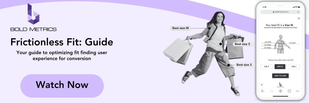
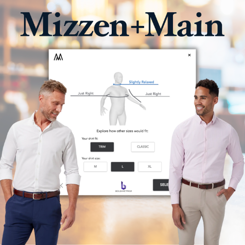
Of course, usability is also critical for fit finding. Because Bold Metrics’ smart sizing experience is universal across all websites that use it (with the exception of merchants that use the API to customize experiences – more on that later), we’ve invested in optimizing every visual and functional element of our smart sizer widget, and have made user testing a critical piece of product development and design.